<!doctype html>
<html lang="en">
<head>
<meta charset="utf-8">
<meta name="viewport" content="width=device-width, initial-scale=1, viewport-fit=cover">
<title>Planning and delivering sustainable mobility | MobiliseYourCity</title>
<meta name="author" content="Jeremi Pasanen for the MobiliseYourCity Secretariat">
<!--
Introductory page: SUMPs, NUMPs and implementation support.
Embeds myc_map_static.html (upload both files to the same folder, or change MAP_URL below).
Figures: MobiliseYourCity Global Monitor 2026.
-->
<link rel="preconnect" href="https://fonts.googleapis.com">
<link rel="preconnect" href="https://fonts.gstatic.com" crossorigin>
<link href="https://fonts.googleapis.com/css2?family=Manrope:wght@400;500;600;700&family=Radio+Canada+Big:wght@500;600;700&display=swap" rel="stylesheet">
<style>
:root {
--text: #002c47; --body: #22394a; --muted: #5b6d7c; --line: #e3e8ec;
--sump: #0096d3; --sump-deep: #0060ad; --sump-tint: #eef7fd;
--nump: #00a396; --nump-deep: #02473f; --nump-tint: #ecfaf8;
--sup: #f257a1; --sup-deep: #9e2458; --sup-tint: #fdf0f6;
--font-title: 'Radio Canada Big', 'Manrope', sans-serif;
--font-body: 'Manrope', ui-sans-serif, system-ui, -apple-system, 'Segoe UI', Roboto, Arial, sans-serif;
}
* { box-sizing: border-box; }
html, body { margin: 0; padding: 0; background: #fff; color: var(--body); font-family: var(--font-body); }
a { color: inherit; }
.wrap { max-width: 1120px; margin: 0 auto; padding: 0 24px; }
section { padding: 56px 0; }
h1, h2, h3 { font-family: var(--font-title); color: var(--text); font-weight: 600; letter-spacing: -.012em; margin: 0; }
h2 { font-size: clamp(26px, 3vw, 34px); line-height: 1.12; }
h3 { font-size: 21px; line-height: 1.2; }
p { margin: 0; line-height: 1.6; }
.lead { font-size: 17px; line-height: 1.6; color: var(--body); max-width: 62ch; }
.section-intro { max-width: 64ch; margin-top: 12px; color: var(--muted); font-size: 15.5px; }
:is(a, button):focus-visible { outline: 2px solid var(--sump); outline-offset: 3px; border-radius: 6px; }
/* ---------- hero ---------- */
.hero { padding: 64px 0 44px; }
.hero-grid { display: grid; grid-template-columns: 1.35fr 1fr; gap: 56px; align-items: end; }
.hero h1 { font-size: clamp(34px, 4.6vw, 54px); line-height: 1.04; letter-spacing: -.02em; }
.hero .lead { margin-top: 22px; }
.hero-actions { display: flex; gap: 10px; flex-wrap: wrap; margin-top: 28px; }
.btn { display: inline-flex; align-items: center; min-height: 42px; padding: 10px 20px; border-radius: 999px; text-decoration: none;
font-weight: 700; font-size: 14px; transition: background .15s ease, border-color .15s ease, color .15s ease; }
.btn.solid { background: var(--text); color: #fff; }
.btn.solid:hover { background: var(--sump-deep); }
.btn.line { border: 1px solid var(--line); color: var(--text); background: #fff; }
.btn.line:hover { border-color: var(--sump); color: var(--sump-deep); }
.figures { margin: 0; padding-left: 24px; border-left: 2px solid var(--line); font-size: 19px; line-height: 1.6; color: var(--body); }
.figures strong { color: var(--text); font-weight: 700; }
.figures small { display: block; margin-top: 6px; font-size: 12px; color: var(--muted); }
/* ---------- the three areas ---------- */
.areas { display: grid; grid-template-columns: 1fr 1fr; gap: 0 40px; margin-top: 34px; }
.area { padding: 26px 0 4px; border-top: 1px solid var(--line); }
.area h3 { margin: 0; }
.area p { margin-top: 10px; font-size: 15px; }
.area .more { display: inline-block; margin-top: 16px; font-size: 14px; font-weight: 700; text-decoration: none; color: var(--text);
border-bottom: 1.5px solid var(--line); padding-bottom: 1px; transition: border-color .15s ease; }
.area.sump .more:hover { border-color: var(--sump); }
.area.nump .more:hover { border-color: var(--nump); }
.area.sup .more:hover { border-color: var(--sup); }
/* connector: both kinds of plan lead into implementation support */
.bridge { grid-column: 1 / -1; position: relative; height: 54px; margin-top: 18px; }
.bridge::before, .bridge::after { content: ''; position: absolute; top: 0; width: 25%; height: 27px;
border-bottom: 1px solid #d5dce2; }
.bridge::before { left: 25%; border-left: 1px solid #d5dce2; border-bottom-left-radius: 14px; }
.bridge::after { right: 25%; border-right: 1px solid #d5dce2; border-bottom-right-radius: 14px; }
.bridge span { position: absolute; left: 50%; top: 27px; transform: translateX(-50%); height: 27px; border-left: 1px solid #d5dce2; }
.bridge em { position: absolute; left: calc(50% + 12px); top: 28px; font-style: normal; font-size: 13px; font-weight: 600; color: var(--muted); }
.area.sup { grid-column: 1 / -1; display: grid; grid-template-columns: 1.1fr 1fr; gap: 40px; padding-bottom: 0; }
.types { list-style: none; margin: 0; padding: 0; border-top: 1px solid var(--line); align-self: start; }
.types li { padding: 13px 0; border-bottom: 1px solid var(--line); }
.types b { display: block; color: var(--text); font-size: 14.5px; }
.types span { display: block; margin-top: 3px; font-size: 13.5px; line-height: 1.5; color: var(--muted); }
.note { margin-top: 14px; font-size: 13.5px; color: var(--muted); }
/* ---------- map ---------- */
.map-section { background: #f7f9fa; }
.map-head { display: flex; justify-content: space-between; align-items: flex-end; gap: 20px; flex-wrap: wrap; }
.tabs { display: inline-flex; gap: 4px; padding: 4px; border-radius: 999px; background: #fff; border: 1px solid var(--line); }
.tabs button { border: 0; background: transparent; border-radius: 999px; padding: 9px 16px; font: 600 14px var(--font-body); color: var(--muted);
cursor: pointer; transition: background .15s ease, color .15s ease; }
.tabs button:hover { color: var(--text); }
.tabs button[aria-selected="true"] { background: #eef2f5; color: var(--text); }
.map-caption { display: flex; align-items: center; gap: 10px; flex-wrap: wrap; margin: 22px 0 12px; font-size: 14px; color: var(--body); }
.map-caption i { width: 11px; height: 11px; border-radius: 50%; border: 1.5px solid #fff; box-shadow: 0 0 0 1px rgba(0,44,71,.15); }
.map-caption i.area-key { border-radius: 3px; opacity: .55; }
.map-frame { width: 100%; height: 740px; border: 0; display: block; }
@media (max-width: 860px) {
section { padding: 44px 0; }
.hero-grid { grid-template-columns: 1fr; gap: 32px; }
.areas { grid-template-columns: 1fr; }
.area { padding-bottom: 30px; }
.bridge { display: none; }
.area.sup { grid-template-columns: 1fr; gap: 16px; }
.region { grid-template-columns: 1fr; gap: 8px; }
.pubs { grid-template-columns: 1fr 1fr; }
.map-frame { height: 600px; }
}
@media (max-width: 520px) {
.pubs { grid-template-columns: 1fr; gap: 0; border-top: 1px solid var(--line); }
.pub { display: grid; grid-template-columns: 96px 1fr; column-gap: 16px; padding: 18px 0; border-bottom: 1px solid var(--line); }
.pub-img { grid-row: 1 / span 4; border-radius: 10px; align-self: start; }
.pub .kind { margin-top: 0; }
.pub h3 { font-size: 16px; }
.pub p { font-size: 13.5px; }
.pub .read { padding-top: 8px; }
.offer-more { margin-top: 24px; border-top: 0; padding-top: 0; }
}
@media (prefers-reduced-motion: reduce) { * { transition: none !important; } }
</style>
</head>
<body>
<main>
<!-- ===== Hero ===== -->
<header class="hero">
<div class="wrap hero-grid">
<div>
<h1>Mobility Planning & Implementation Support</h1>
<p class="lead">MobiliseYourCity helps cities and national governments plan for sustainable urban mobility, and to turn plans into projects on the ground. Our technical assistance covers urban mobility plans for cities, national policies and investment programmes for countries, and the implementation support that moves projects from planning to delivery.</p>
<div class="hero-actions">
<a class="btn solid" href="#map">Explore the map</a>
<a class="btn line" href="https://www.mobiliseyourcity.net/our-full-methodological-offer">See our full methodological offer</a>
</div>
</div>
</div>
</header>
<!-- ===== What we support ===== -->
<section id="areas">
<div class="wrap">
<h2>How we support cities and countries</h2>
<p class="section-intro">Planning happens at two levels, cities and national governments, and both lead into implementation. The same methodology runs through all three, adapted to each place's institutions and resources.</p>
<div class="areas">
<article class="area sump">
<h3>Sustainable Urban Mobility Plans (SUMPs)</h3>
<p>A Sustainable Urban Mobility Plan (SUMP) is a strategic plan developed in a participatory and integrated way to meet people's and businesses' mobility needs in cities and to harmonize and integrate existing planning approaches. It sets cities on a sustainable course regarding land use and urban mobility. Because each city is starting with a different baseline of transport plans, MobiliseYourCity implementing partners and city members work together to adapt the SUMP process for local needs. </p>
<p>Because each measure is costed and prioritised, an adopted SUMP gives a city a credible investment pipeline to present to governments, development banks and other financiers.</p>
<a class="more" href="https://www.mobiliseyourcity.net/sustainable-urban-mobility-plan-sumps-toolkit" target="_top">Open the SUMP toolkit</a>
</article>
<article class="area nump">
<h3>National Urban Mobility Policies and Investment Programmes (NUMPs)</h3>
<p>A National Urban Mobility Policy or Investment Programme (NUMP) is a strategic, action-oriented framework for urban mobility, developed by national governments, enacted to enhance the capability of cities to plan, finance and implement projects and measures designed to fulfil the mobility needs of people and businesses in cities and their surroundings in a sustainable manner.</p>
<p>It aligns ministries, regions and cities around shared priorities and connects them to national budgets and development finance, so that city plans have the backing they need.</p>
<a class="more" href="https://www.mobiliseyourcity.net/national-urban-mobility-policies-and-investment-programmes-numps-toolkit" target="_top">Open the NUMP toolkit</a>
</article>
<div class="bridge" aria-hidden="true"><span></span><em>From plan to project</em></div>
<article class="area sup">
<div>
<h3>Implementation support</h3>
<p>A SUMP or NUMP defines priorities, but its measures are not yet projects. Implementation support adds the technical, financial and institutional detail needed to build, finance and run them.</p>
<p>It is now the largest share of the Partnership's work, with a focus on areas that are often underfunded, such as paratransit reform, walking and cycling, and governance.</p>
<p class="note">Most projects combine several of these types, depending on local priorities and capacity.</p>
<a class="more" href="https://www.mobiliseyourcity.net/our-full-methodological-offer" target="_top">See our full methodological offer</a>
</div>
<ul class="types">
<li><b>SUMP or NUMP implementation</b><span>Continued engagement after the planning phase to turn plan measures into real projects, usually combining the three types below.</span></li>
<li><b>Pilot projects</b><span>Small, quick interventions that test and demonstrate new approaches before they are scaled up.</span></li>
<li><b>Project preparation</b><span>Pre-feasibility and feasibility studies that turn planning priorities into project concepts ready for financing.</span></li>
<li><b>Institutional strengthening</b><span>Support for the governance, coordination and technical capacity of public authorities in member cities and countries.</span></li>
</ul>
</article>
</div>
</div>
</section>
<!-- ===== Map ===== -->
<section class="map-section" id="map">
<div class="wrap">
<div class="map-head">
<div>
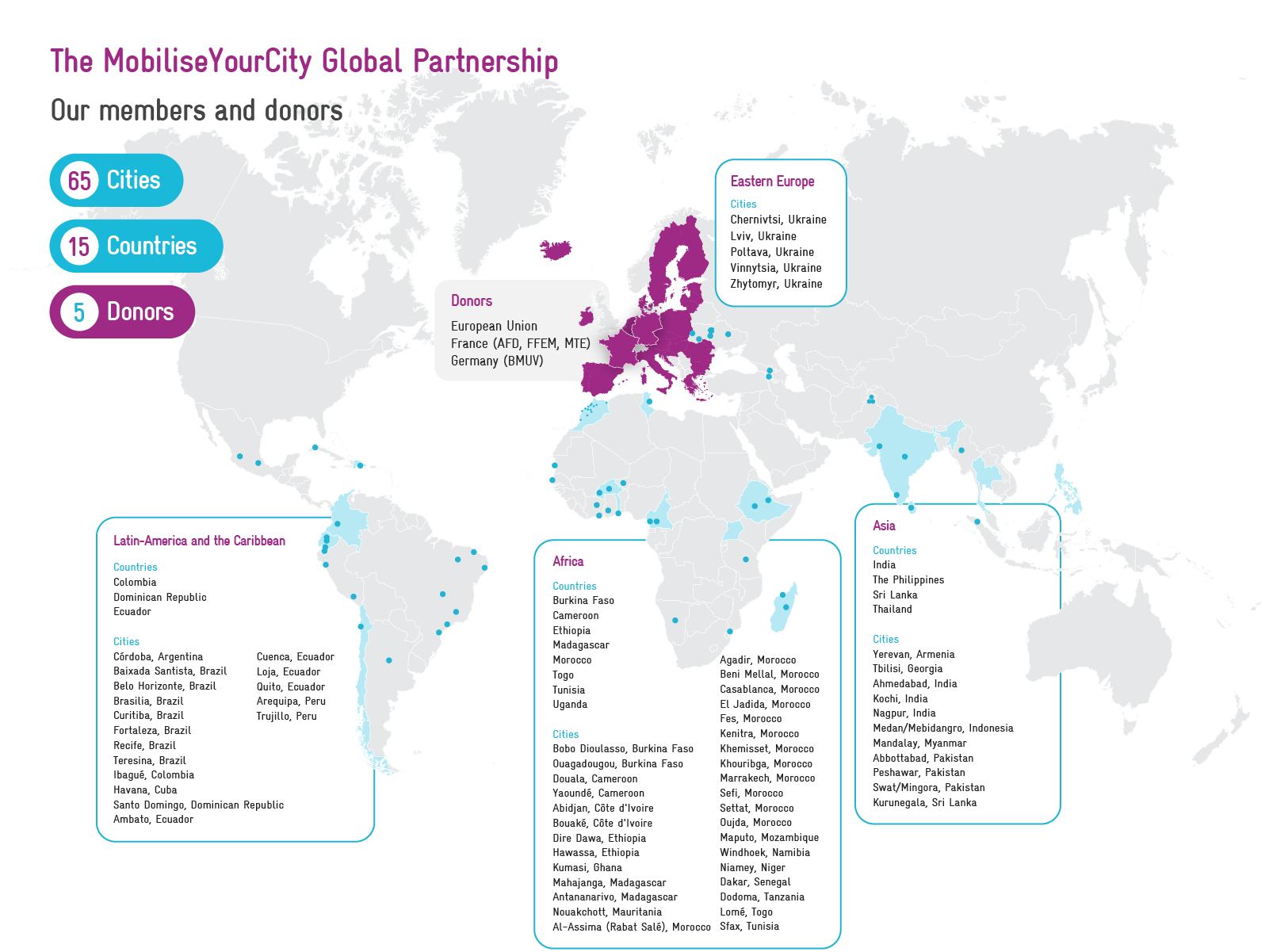
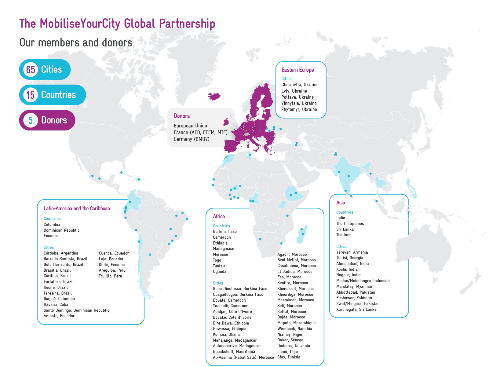
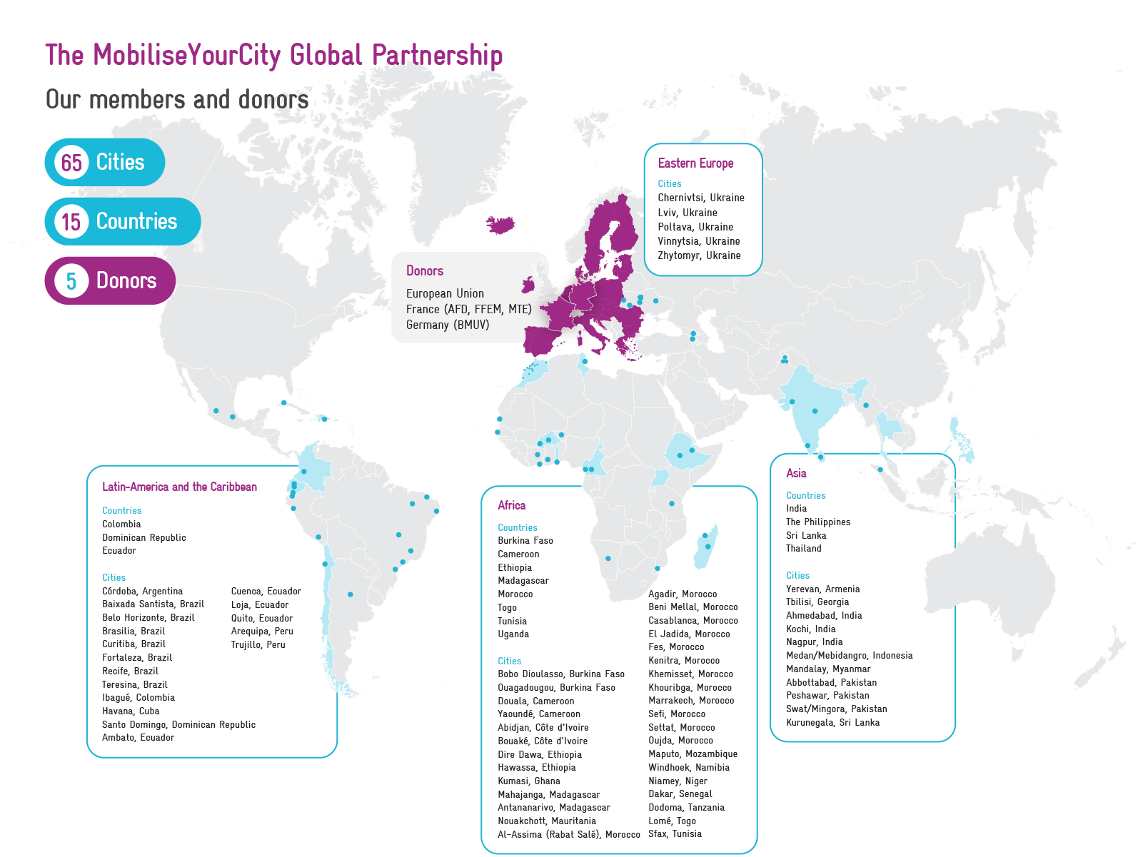
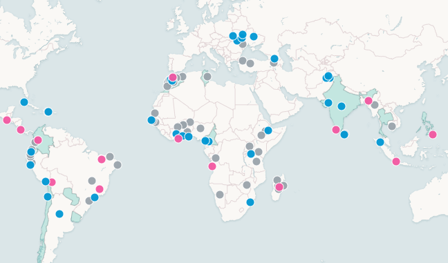
<h2>Our projects around the world</h2>
</div>
<div class="tabs" role="tablist" aria-label="Map view">
<button role="tab" data-view="sump" aria-selected="true">SUMPs</button>
<button role="tab" data-view="nump" aria-selected="false">NUMPs</button>
<button role="tab" data-view="support" aria-selected="false">Implementation support</button>
</div>
</div>
<div class="map-caption" id="mapCaption"></div>
<iframe class="map-frame" id="mapFrame" title="Map of MobiliseYourCity projects" loading="lazy"></iframe>
</div>
</section>
<script>
// Address of the static map. With both files uploaded to the same folder, the file name is enough.
const MAP_URL = 'myc_map_static.html';
const VIEWS = {
sump: { key: '<i style="background:#0096d3"></i>Cities with a Sustainable Urban Mobility Plan' },
nump: { key: '<i class="area-key" style="background:#00a396"></i>Countries with a National Urban Mobility Policy or Investment Programme' },
support: { key: '<i style="background:#f257a1"></i>Cities and countries receiving implementation support' }
};
const frame = document.getElementById('mapFrame');
const caption = document.getElementById('mapCaption');
function show(view) {
document.querySelectorAll('.tabs button').forEach(b => b.setAttribute('aria-selected', String(b.dataset.view === view)));
caption.innerHTML = VIEWS[view].key;
frame.src = MAP_URL + '?view=' + view;
}
document.querySelectorAll('.tabs button').forEach(b => b.addEventListener('click', () => show(b.dataset.view)));
document.querySelector('.tabs').addEventListener('keydown', ev => { // arrow keys move between tabs
if (!['ArrowLeft', 'ArrowRight'].includes(ev.key)) return;
const tabs = [...document.querySelectorAll('.tabs button')];
const i = tabs.findIndex(t => t.getAttribute('aria-selected') === 'true');
const next = tabs[(i + (ev.key === 'ArrowRight' ? 1 : -1) + tabs.length) % tabs.length];
next.focus(); show(next.dataset.view);
});
show('sump');
// The map reports its height; size the frame to match.
window.addEventListener('message', ev => {
if (ev.source === frame.contentWindow && ev.data && typeof ev.data.mycExplorerHeight === 'number') {
frame.style.height = ev.data.mycExplorerHeight + 'px';
}
});
// Report this page's height to the Drupal page around it, using the same embed snippet as the maps.
if (window.parent !== window) {
const post = () => window.parent.postMessage({ mycExplorerHeight: Math.ceil(document.documentElement.getBoundingClientRect().height) }, '*');
post(); new ResizeObserver(post).observe(document.documentElement);
}
</script>
</body>
</html>